Team: David Bowman, Craig Mangum, Emily Maurer, Madi Jackson, Sam Verdine
Role: identity design, art direction, information architecture, website design, design system development
Role: identity design, art direction, information architecture, website design, design system development
In 2020, the WordPress VIP brand was repositioned around the idea “content for growth.” Our team updated the brand identity system to reflect the new positioning. We also leveraged this opportunity to unify a fractured design system across all brand touch-points from presale marketing materials to the design of the product itself. Under the direction of David Bowman, I contributed to early brand concepts, extended the new visual identity into a fully fleshed-out digital design system and took the lead in the redesign of the flagship company website. I also art directed and produced a variety of brand assets as we applied the brand across all of the company’s various channels.


Content has become a powerful tool that brands can leverage to expand their influence and grow their businesses. WordPress VIP, with its platform designed to deliver content at scale, backed by a familiar and powerful CMS, has found itself in a unique position to cater to the needs of this fast-growing market. This, in turn, has led to a realignment of the company’s brand positioning around communicating and demonstrating this fact. As part of this strategic shift, VIP is working to differentiate itself by marketing to executives and decision makers who care more about the impact of the VIP product on their business than its technical details.
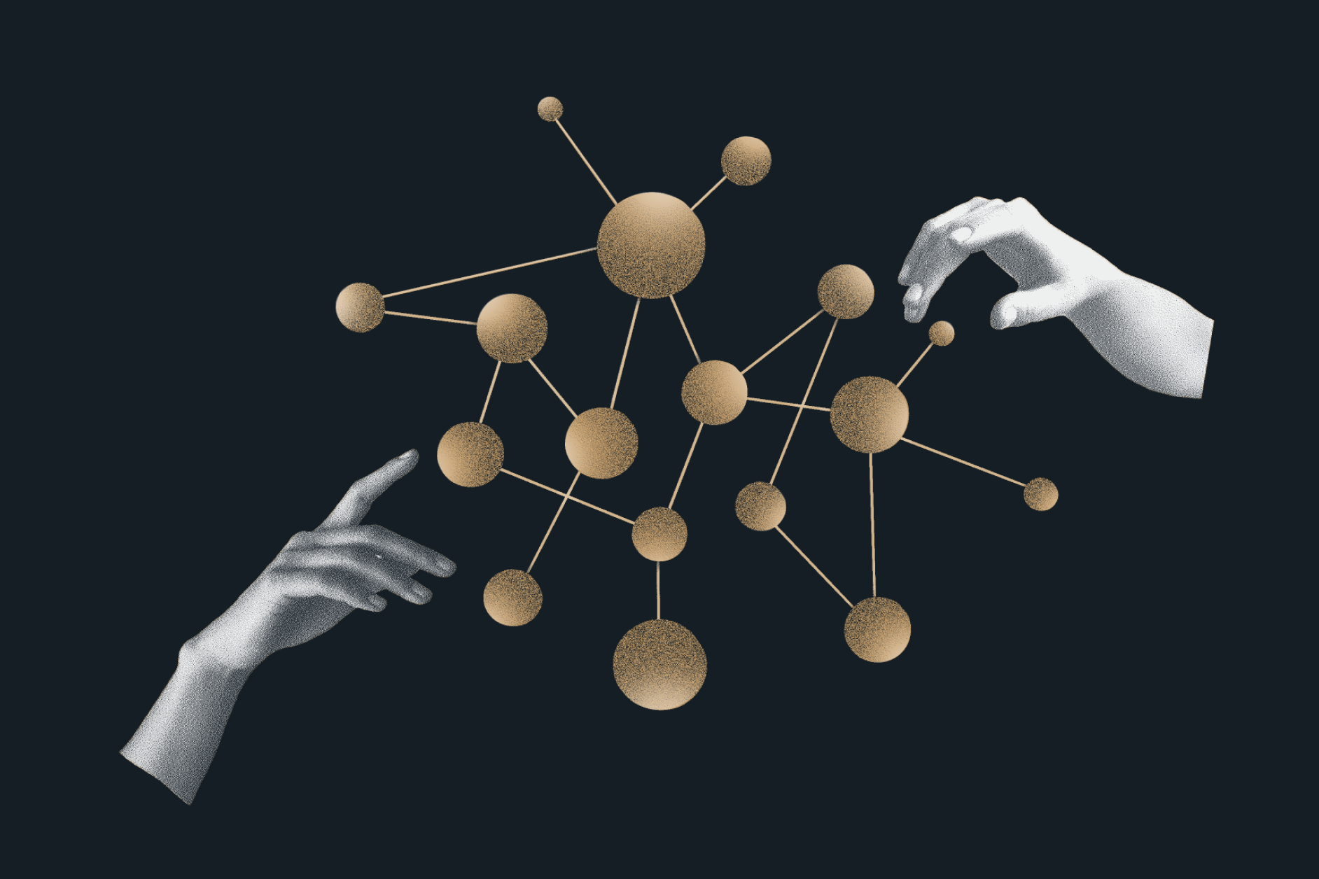
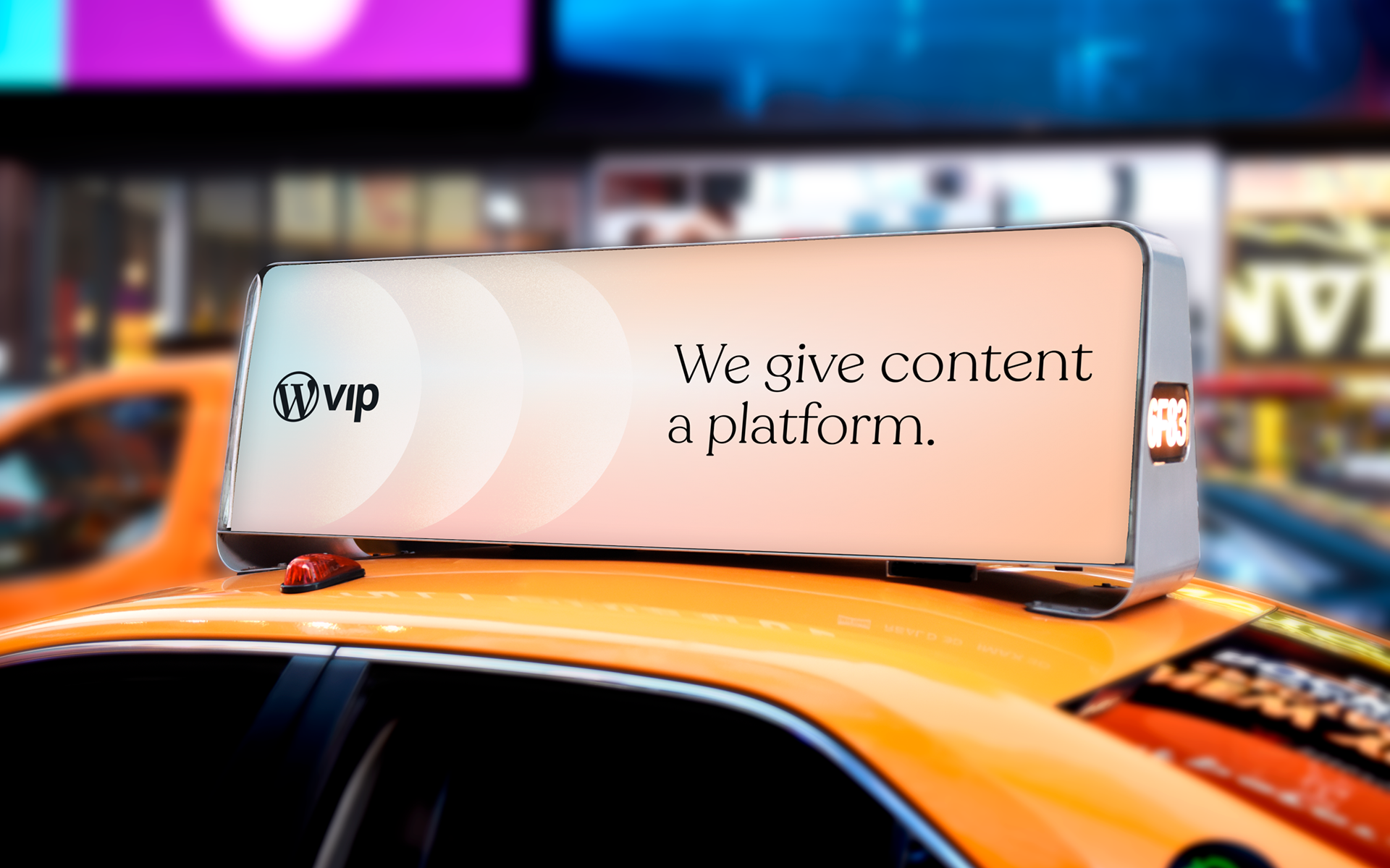
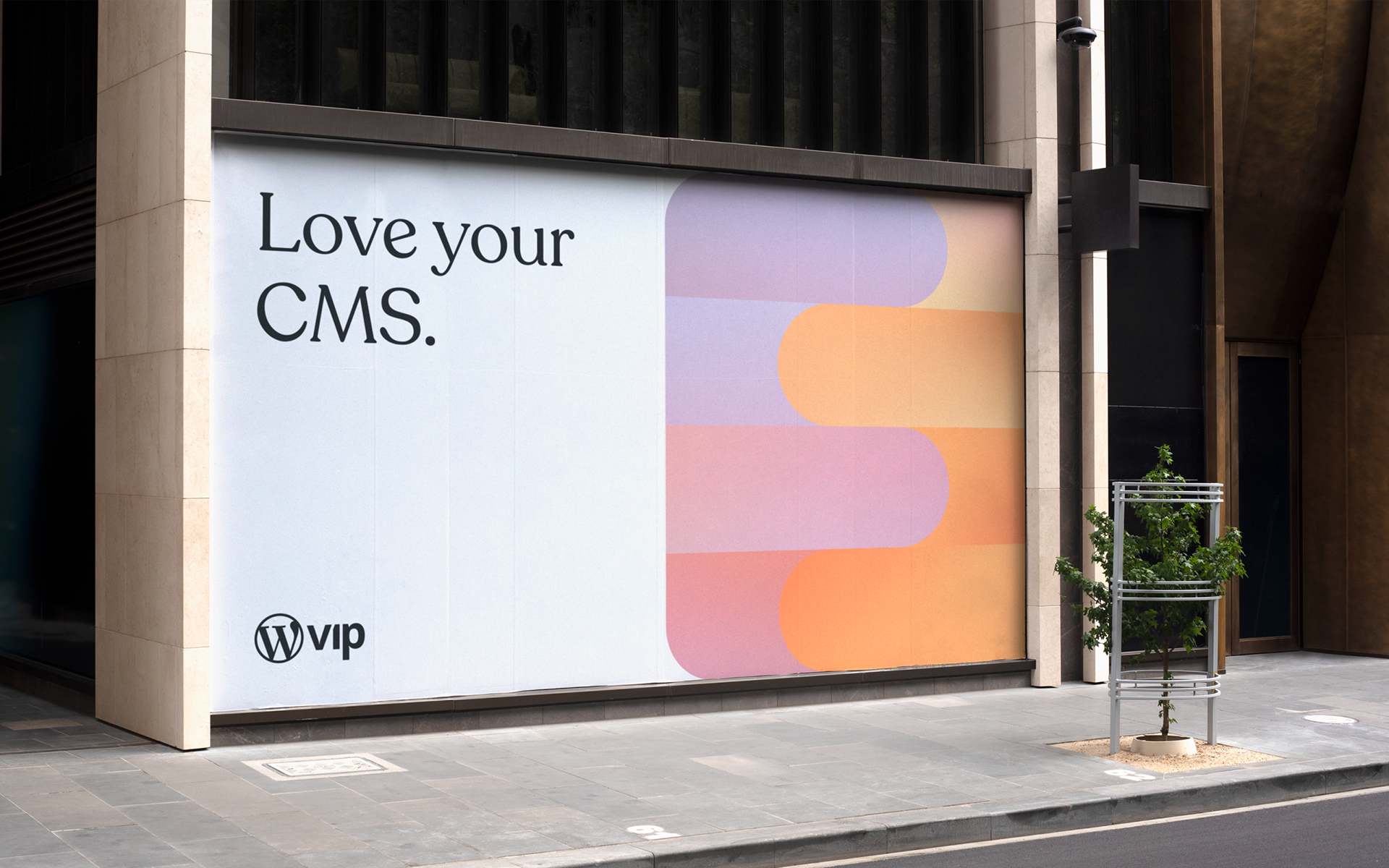
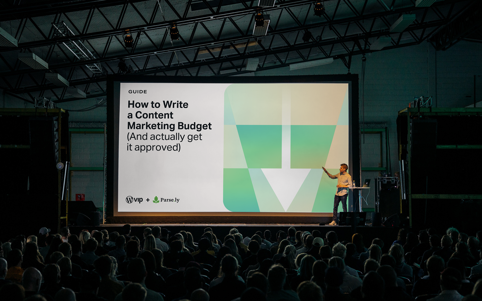
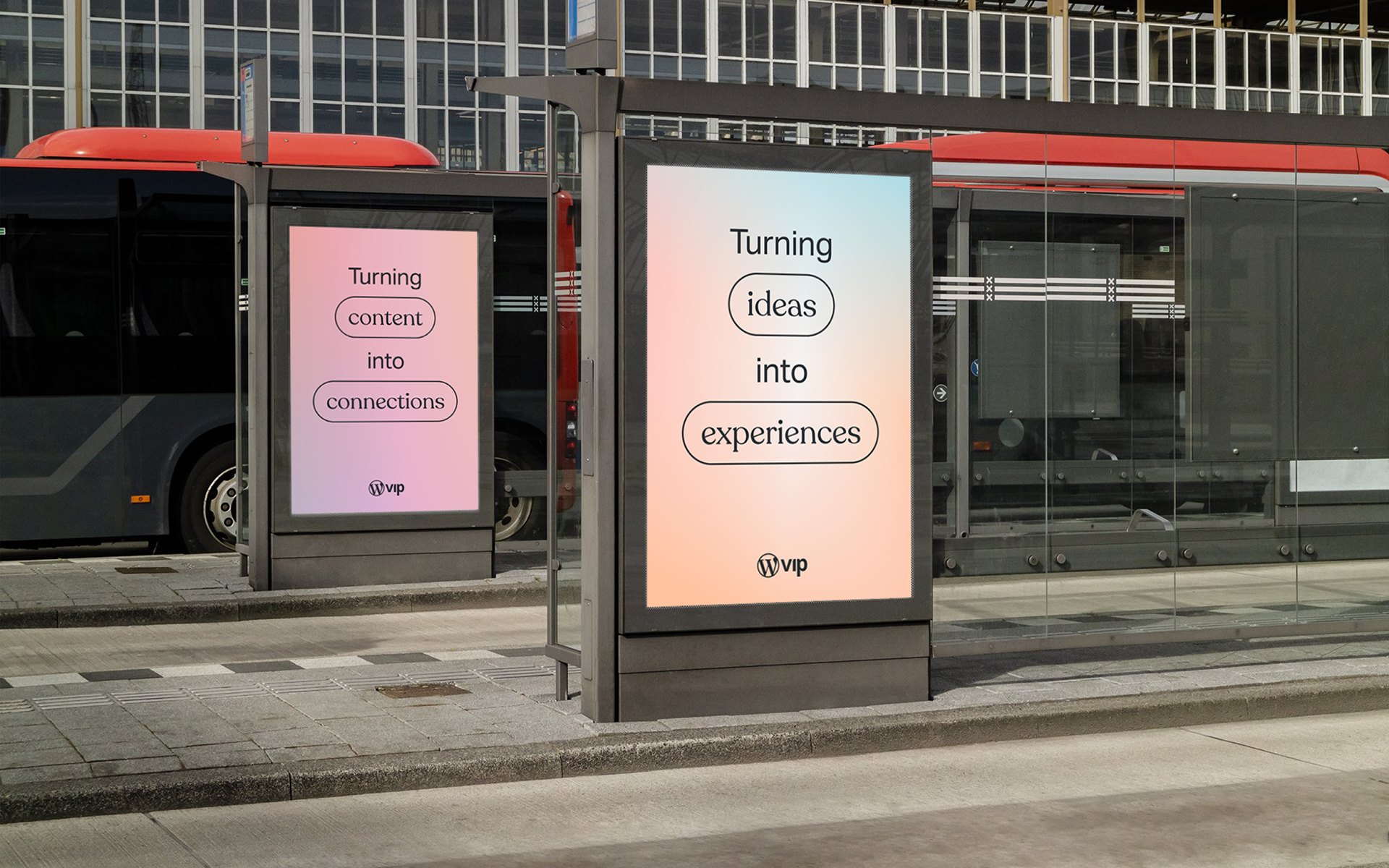
In service to this, the refreshed identity strategically avoids the techy tropes employed by VIP’s competitors and instead focuses on openness, agility, and the power of content. Much of the core visual elements are neutral in tone, with subtle gradients as backgrounds and simple sans-serif typographic treatments. More expressive moments are found in the content that is layered over these backgrounds, with colorful compositions and a characterful serif typeface. Strong and consistent art direction is employed to give an editorial voice to the identity, which complements the focus on content. Color is used strategically throughout the customer journey: brightly colored illustrations are used in pre-sale touchpoints like digital advertising and the website, but recede into a more reserved, neutral palette in the VIP product interface, allowing the client’s content to take center stage.
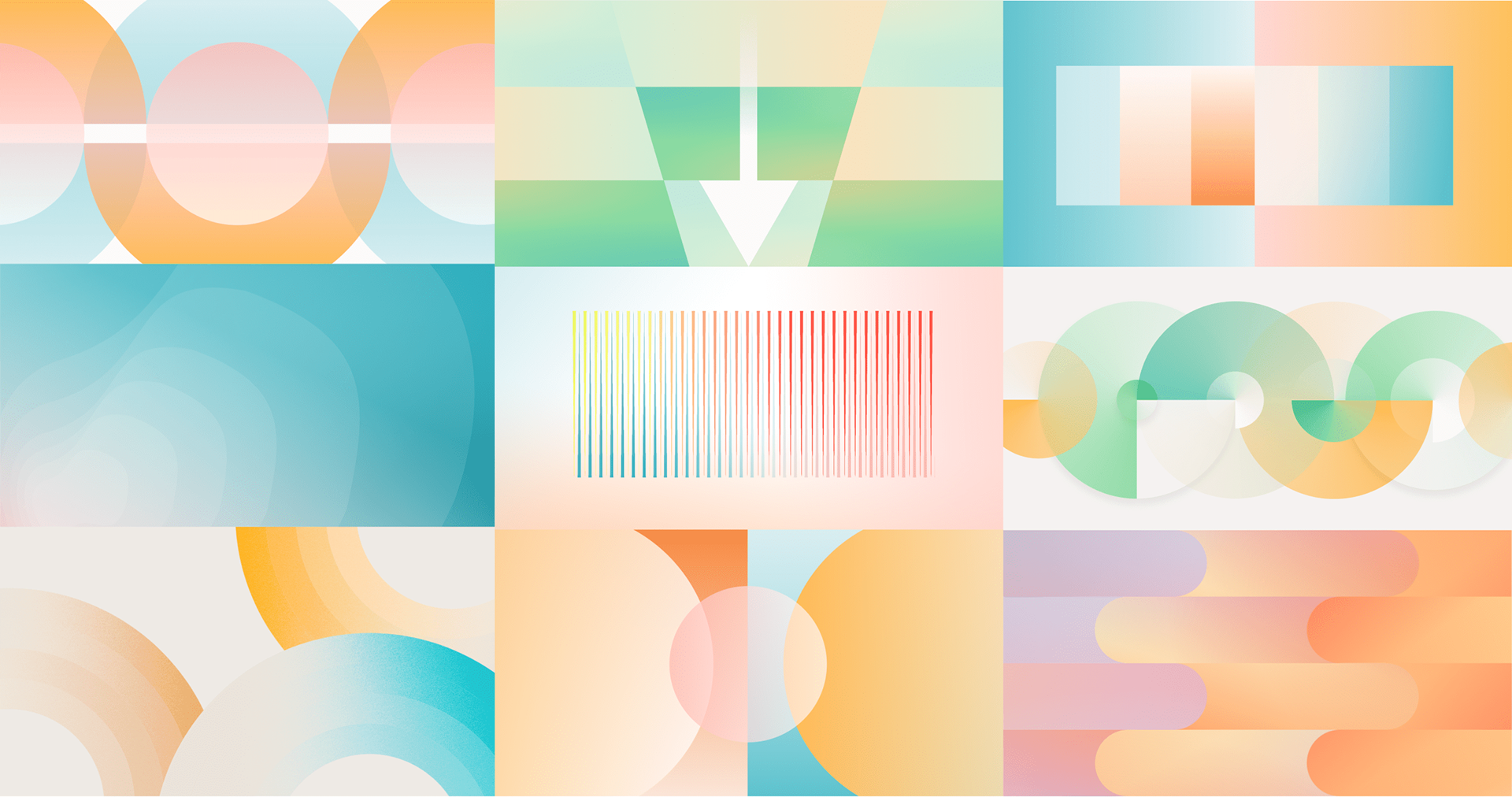
Illustration by Craig Mangum, Madi Jackson, and Sam Verdine. Art directed by David Bowman & Craig Mangum.


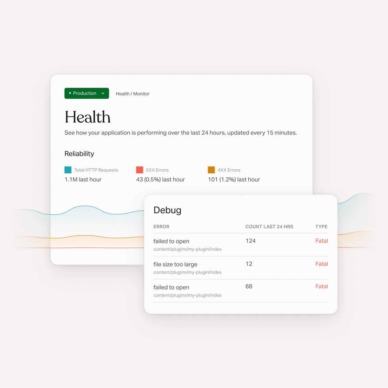
Before designing, we evaluated the information architecture of the site. The new site needed to be content-focused, like the overall identity, and it was essential that the content on the site be accessible. The new design needed to be successful at surfacing relevant content and be easily navigable by potential clients. At the same time, we wanted to provide structure to the editors producing content for and maintaining the website. After an extensive audit, we used site maps to explore how the content should be organized. Through several iterations, we created a structure that clearly delineated information about the product and its benefits and resources for existing clients. At the same time, though, we wanted to create a system wherein we could cross-link information from these two groups with each other. For example, next to marketing information about a particular feature of the VIP product, we could embed links to or previews of relevant resource content, such as a tutorial or documentation article. We felt this cross-pollination would be a powerful mechanism for surfacing content that would be beneficial to our visitors and drive engagement.
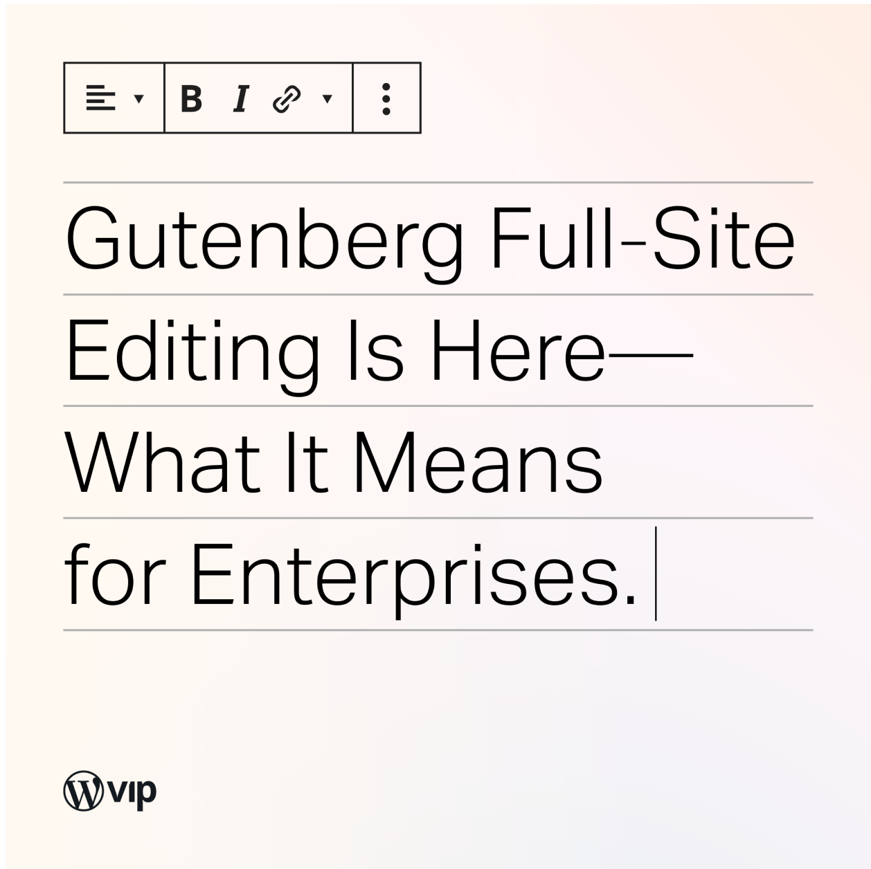
To support this, we needed to create portable content types that could be referenced throughout the site. We created data models for each custom content type and defined the necessary attributes to be populated in the CMS. Custom Gutenberg blocks were also defined to allow editors to compose our new portable content types onto pages of the site. These definitions became the underlying specifications around which we would design the components of our design system.
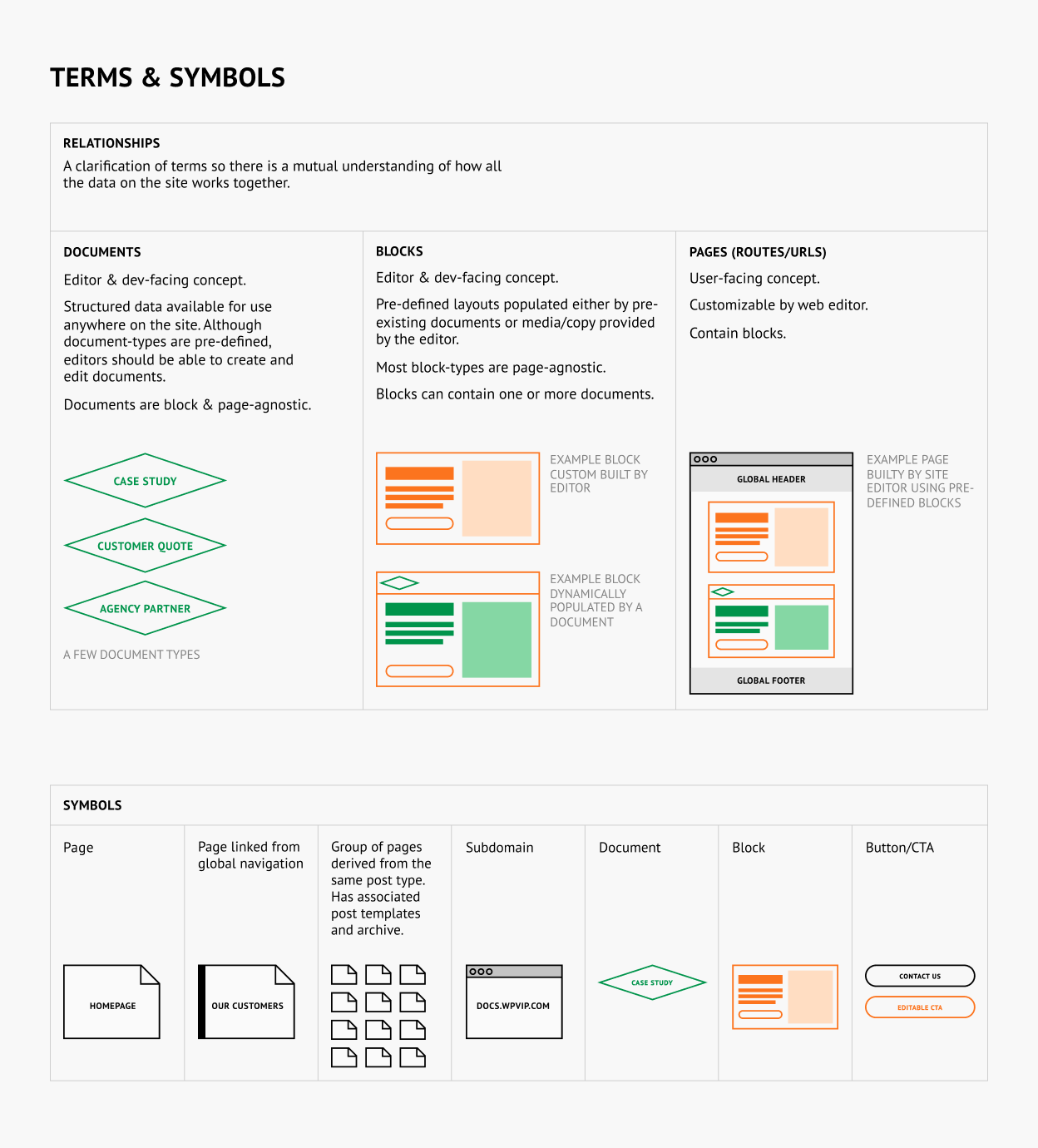
It was useful to define terms and develop a common language early on in the planning phase for the new website. This allowed us to understand the information on the site in terms of content structure, what data could be reused, and how blocks and pages would be populated.
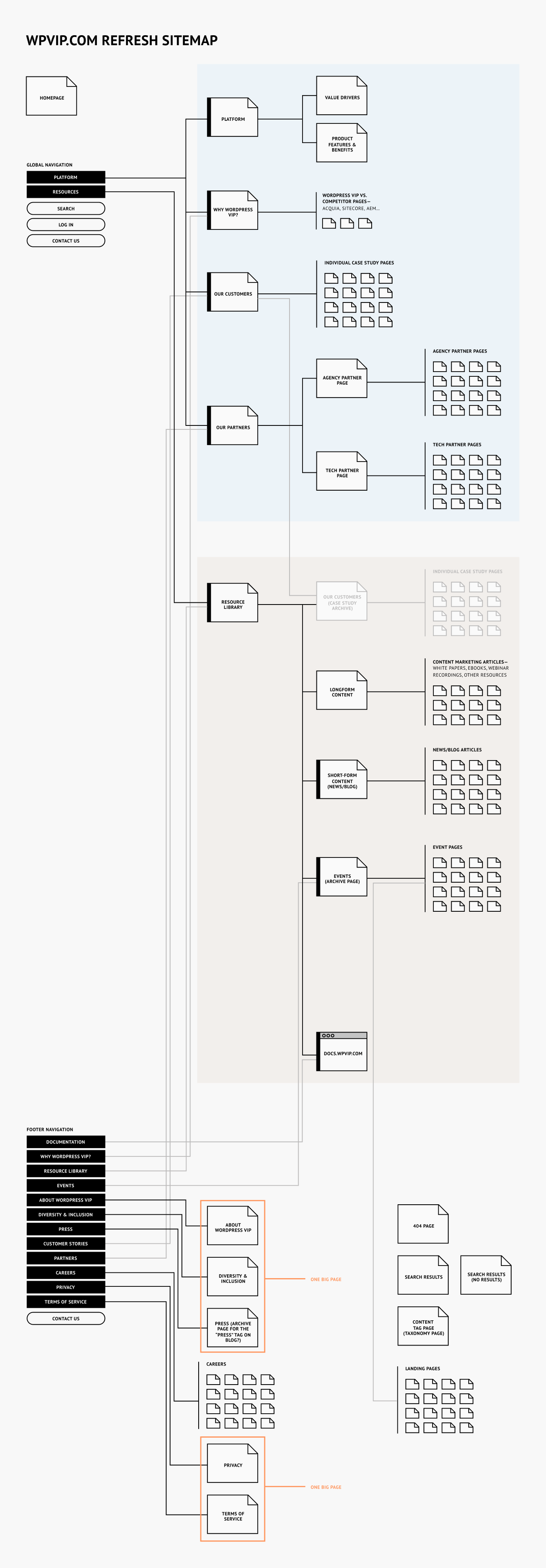
Early sitemap for wpvip.com

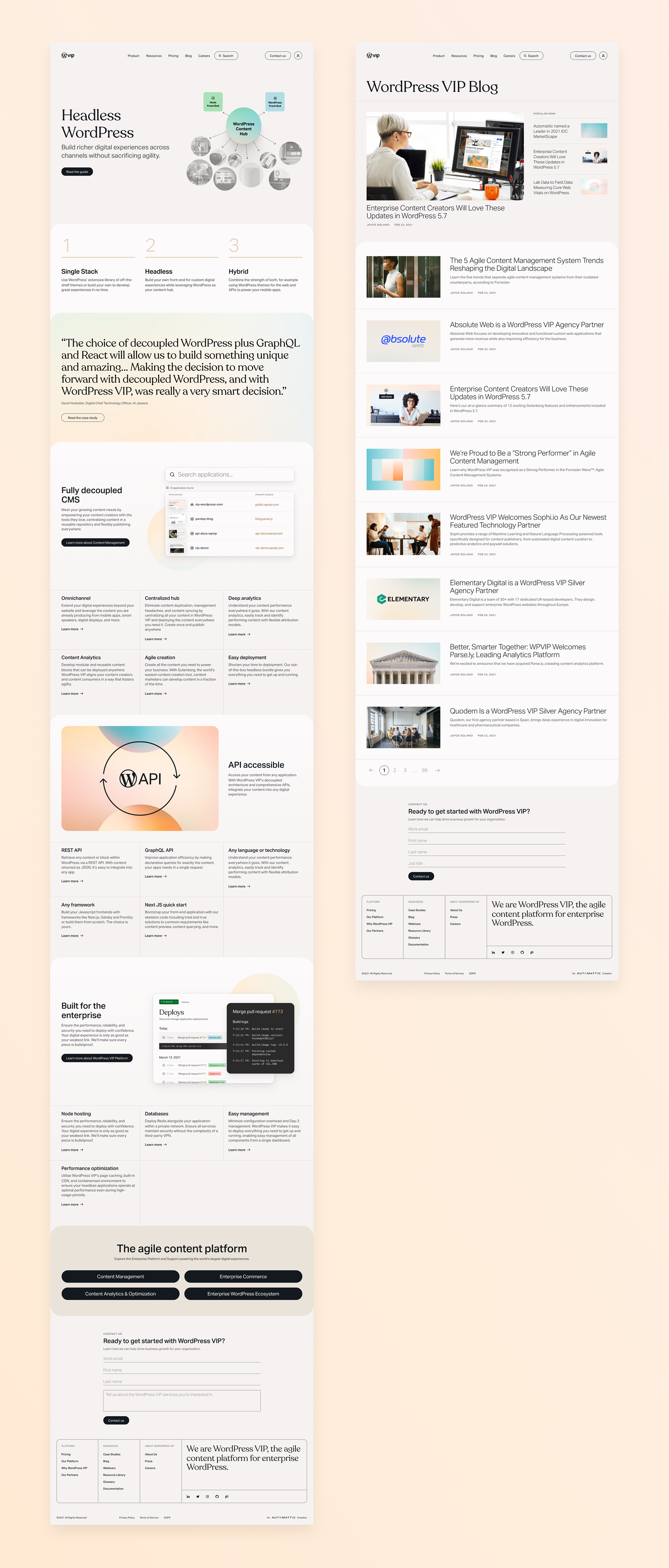

The extension of the visual identity into a digital design system for the website was critical. It allows us to have a central library of components that can be accessed by all members of the team, ensuring consistency and efficiency in composing pages and designing future components. This shared resource enables us to establish processes for design governance to ensure consistent application of the system across the website. (This is something we are actively working to implement at VIP today.) It also gives us a scalable core that can grow with us; we regularly iterate on components and have several new ones currently in the design pipeline.

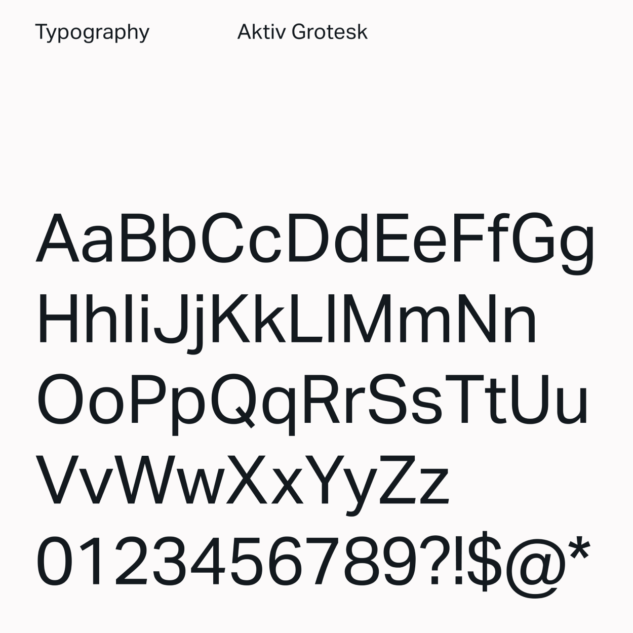
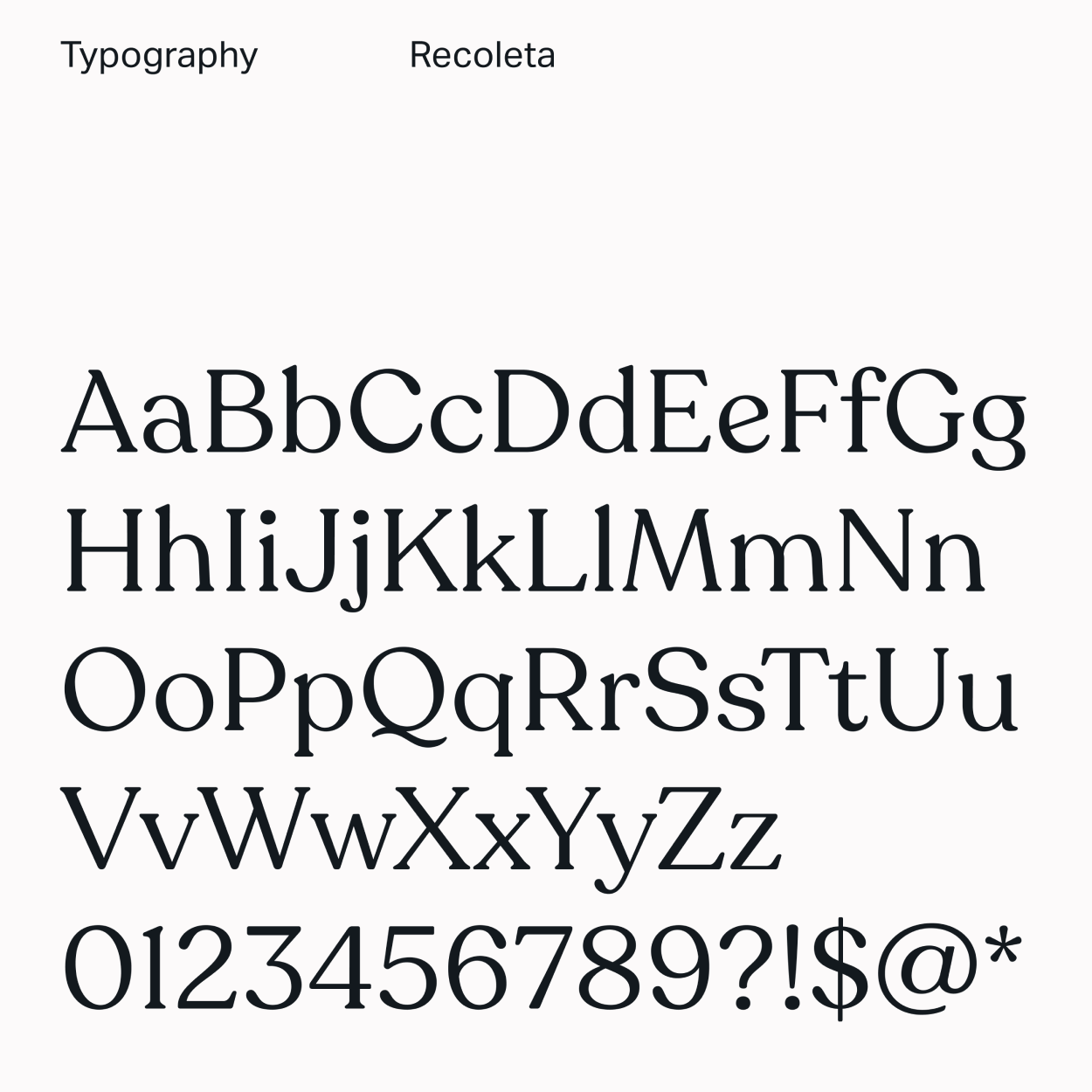
Sample type styles from our larger type system.

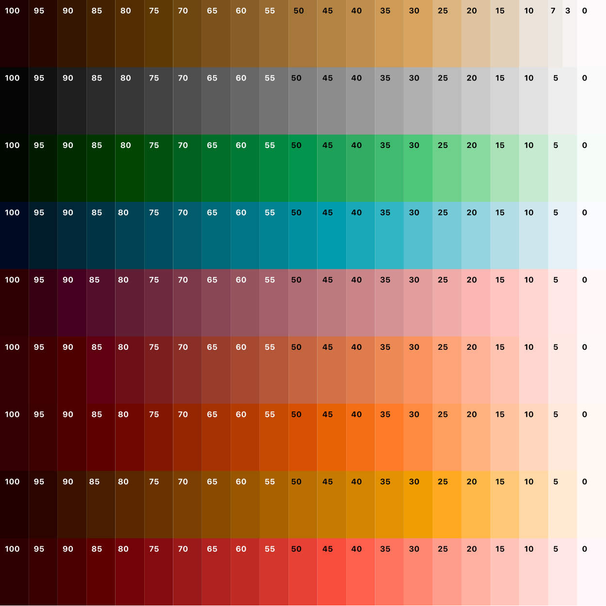
The brand color palette was expanded for digital applications.

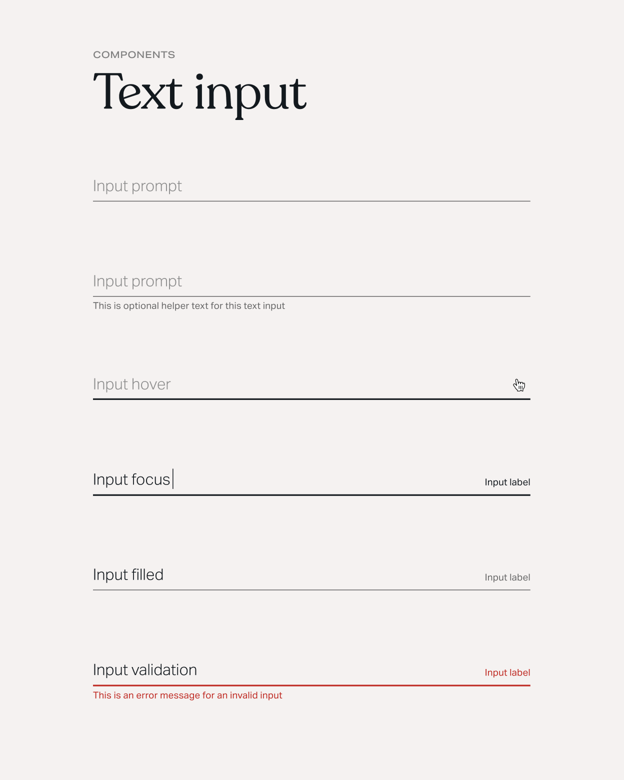


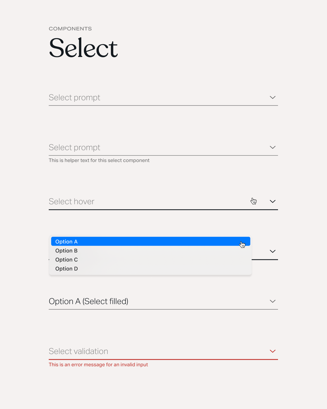
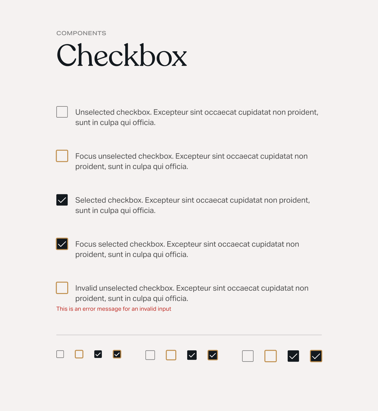
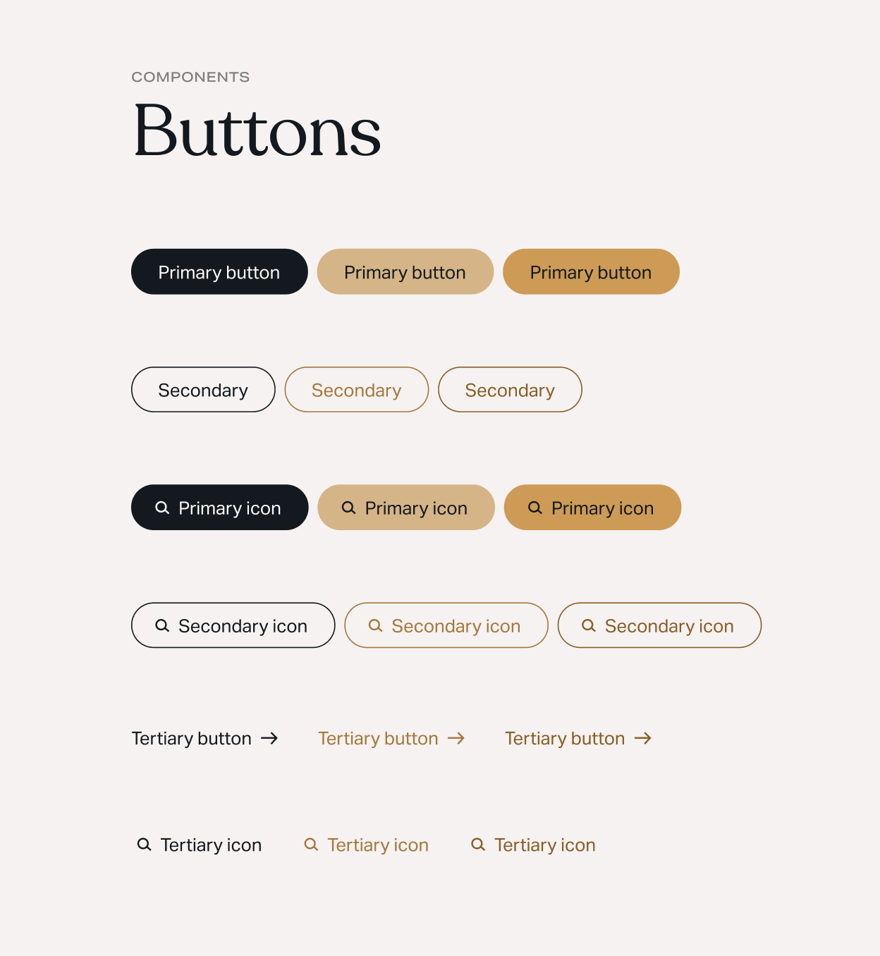
A few sample components and their various states.
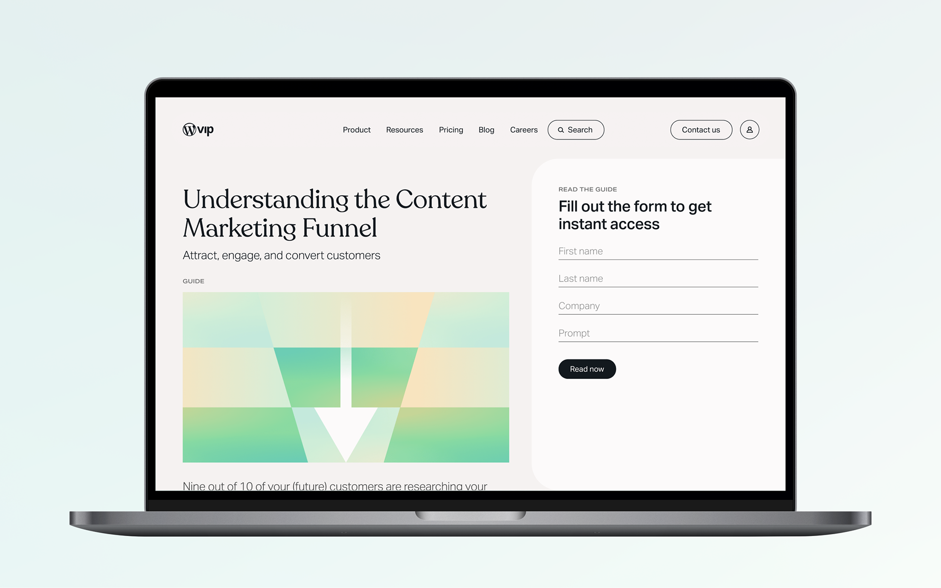

House style for product imagery developed by me. Created by Madi Jackson, art directed by me. Creative direction from David Bowman.